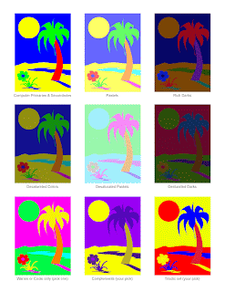
In class project with colors
Tuesday, October 30, 2012
Sunday, October 28, 2012
spheres!!!
so for these first 3, I noticed that the flow is like how a brush works: how fluid the stroke comes off of the pen/brush. Opacity helped with the overlay of colors and helped bring out a smoother composition. the blue one was the fist attempt and just came out bad.
These next 3 were just testing out something I noticed in class. What if the opacity and flow added up together to make 100%? Would it make a better painting or is it going to be the same? I did not follow this rule for the grey scale because i was still testing out the opacity and flow of the brush. I did notice that if opacity was really low, I would have to work a lot harder than i should, so from now on, I am probably going to use like 50% and higher along with flow. Time to move onto my next projects
These next 3 were just testing out something I noticed in class. What if the opacity and flow added up together to make 100%? Would it make a better painting or is it going to be the same? I did not follow this rule for the grey scale because i was still testing out the opacity and flow of the brush. I did notice that if opacity was really low, I would have to work a lot harder than i should, so from now on, I am probably going to use like 50% and higher along with flow. Time to move onto my next projects
Tuesday, October 23, 2012
Monday, October 22, 2012
Tuesday, October 9, 2012
Subscribe to:
Comments (Atom)


